Style Page
This page shows the various styles for the systemHUB website to use as a guide for styling other pages.
Design Style Guide
The complete style guide system can be accessed here in Figma.
Two Column Header With Image And Buttons
This section is used for the homepage. This row also has the class btn-inline applied to it so the two buttons can be shown side by side.

Trusted by business owners worldwide for their business systems and training


Title Of The Page
The section is for page headers and this sub heading text can be used to add further context for the visitor.
Fixed Width Section
This section has a max-width of 800px which keeps it nice and neat on the page. This is useful for individual features or sections you want the user to focus on.
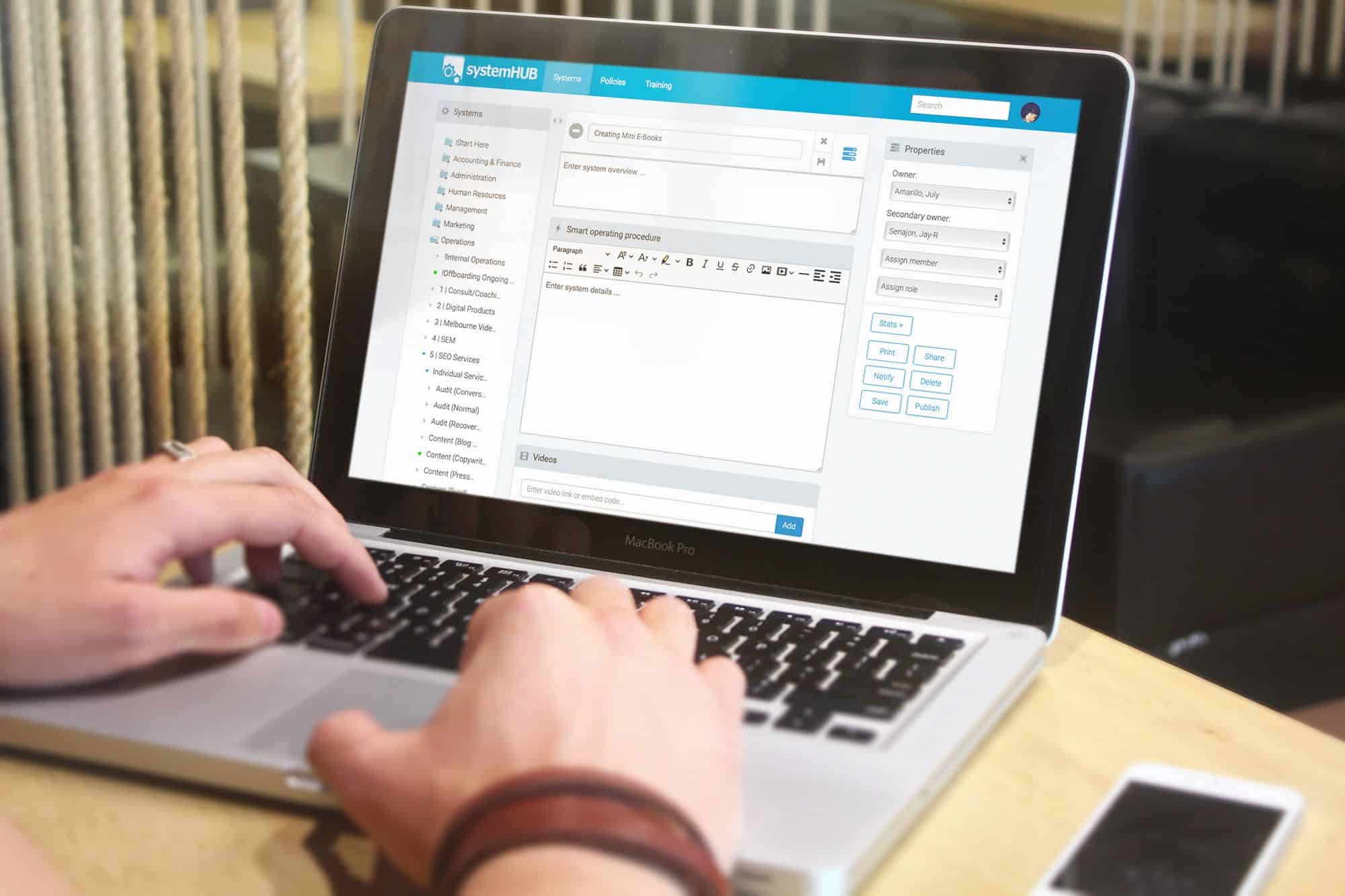
Two Column Layout with icons and a button
This section is useful when text is needed to convey multiple things in a small area. Icons are built in and should match the subject that’s being talked about to make it easy for the reader to visually understand at a glance.
Feature 1
Information about this feature to give context and explain how it benefits the user.
Feature 2
Information about this feature to give context and explain how it benefits the user.
Feature 3
Information about this feature to give context and explain how it benefits the user.
This text has a class of “subhead”
This is the name of a feature and/or benefit
While the heading captures attention, the text below should build interest and desire quickly. Once you do that you can lead the reader to action action. You may also notice that this text is vertically aligned in the center of the image.
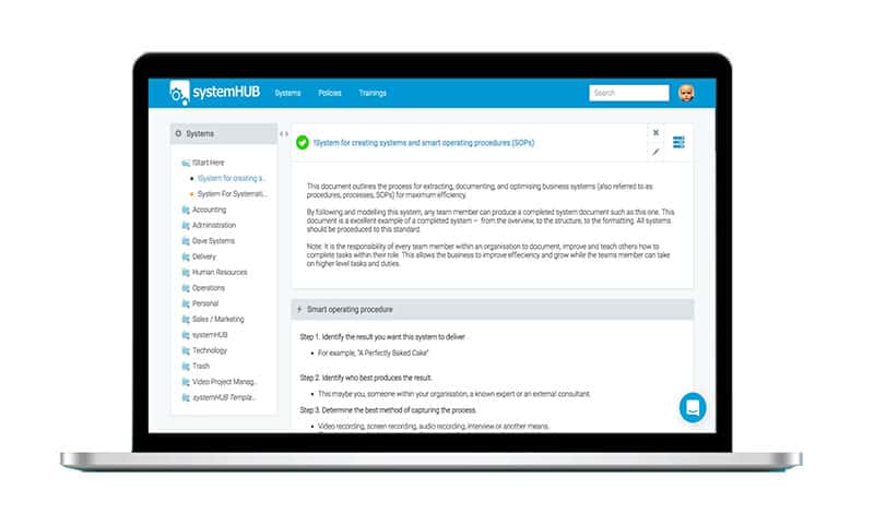
How to create vertical centering with two columns in Divi

This text has a class of “subhead”
The image has a negative margin on desktop
The image to the side has a negative margin on desktop, which gives it an effect where it breaks out of the width of the website. This is used on the homepage for features but can be used on other feature pages too.
This text has a class of “subhead”
The image has a negative margin on desktop
The image to the side has a negative margin on desktop, which gives it an effect where it breaks out of the width of the website. This is used on the homepage for features but can be used on other feature pages too.

“This is a testimonial. Keep it punchy and to the point with a focus on specifics, ease, speed and end results.”
Gary McMahon, Ecosystem Solutions
